learn about all things surface pattern design including the creative design process, being a successful creative entrepreneur & stepping into the mindset of a successful designer
welcome to the pattern design blog
blog
The
Categories
Popular
How to create the 6 most common colour schemes for your Surface Pattern Designs
Colour is one of the most important elements in a design. Learning to work with and have a good eye for colour is imperative in your role as a surface pattern designer, as it can make or break a design. Your choice of colour will determine the mood and feel of your design.
Remember that when people see colour they automatically have an emotional response, so learning to select colours that work well together is an important part of being a surface pattern designer.
To get a better understanding of how colours work together, let’s have a look at how to create the 6 most common colour schemes for your surface pattern designs.
How to create the 6 most common colour schemes for your surface pattern designs
Having a basic understanding of the colour wheel will allow you to understand which colours work together and why.
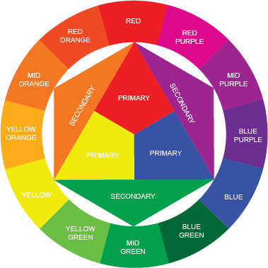
There are 6 main colour schemes you can create by looking at the colour wheel. These schemes are Achromatic, Monochromatic, Related/Analogous, Contrasting/Complementary, Split Complementary and Triadic
1. Achromatic

An achromatic colour scheme is void of any colour so consists only of white, black and grey
2. Monochromatic

A monochromatic colour scheme is one that uses only one colour. From that colour you can create tints (by adding white), shades (by adding black) or tones (by adding grey). This is the easiest colour scheme to create and is visually cohesive as the colours work harmoniously together.
3. Related/Analogous

Related and Analogous colour schemes are created by using hues/colours that are next to each other on the colour wheel. Colours can either be in the same family or cross over to the adjacent colour family, however, they must be colours that sit next to each other. These schemes are harmonious but as they use colours of similar hues, they can be challenging to create dynamic colour palettes.
Want a free colour cheat sheet? Here it is!
4. Contrasting/Complementary
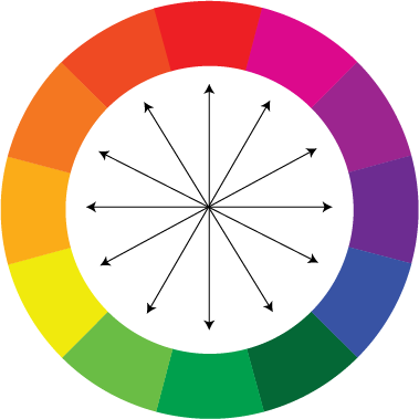
Contrasting/Complementary colour schemes use colours that are opposite each other on the colour wheel. These schemes are high in contrast and create vibrant colour schemes. They need to be used carefully together so as not to create colour palettes that are jarring to the eye. Consider adding white, black or grey to reduce the brightness and vividness of the colours. Also, consider the quantity of each colour used. These schemes work best when there is one main colour with a contrasting colour used in small amounts.
5. Split Complementary
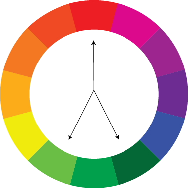
Split complementary colour schemes use three colours. One colour and then two other colours that are either side of the colour directly opposite the first colour on the colour wheel. As with Complementary colour palettes, Split Complementary ranges have strong contrast yet they are less intense than complementary ranges.
6. Triadic
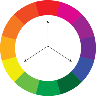
Triadic colour schemes use colours that are an equal distance away from each other on the colour wheel. These colour schemes are contrasting and very dynamic. You can easily create triadic colour palettes that are interesting, vivacious, colourful and visually strong while retaining balance and richness of colour. Balance and harmony are more easily achieved with these colour schemes than with contrasting colour schemes. Try to select one colour to be used as the main or predominant colour and the others as highlights or in small amounts. You can add white, black or grey to the colours to reduce the saturation and tone.
By having a good understanding of the colour wheel and the way colours relate to one and other, you will better be able to create beautiful colour palettes for your surface pattern designs.
Want to create another revenue stream by turning your art into surface pattern designs?
Get the free guide
Get my FREE Surface Pattern Design Starter Guide