learn about all things surface pattern design including the creative design process, being a successful creative entrepreneur & stepping into the mindset of a successful designer
welcome to the pattern design blog
blog
The
Categories
Popular
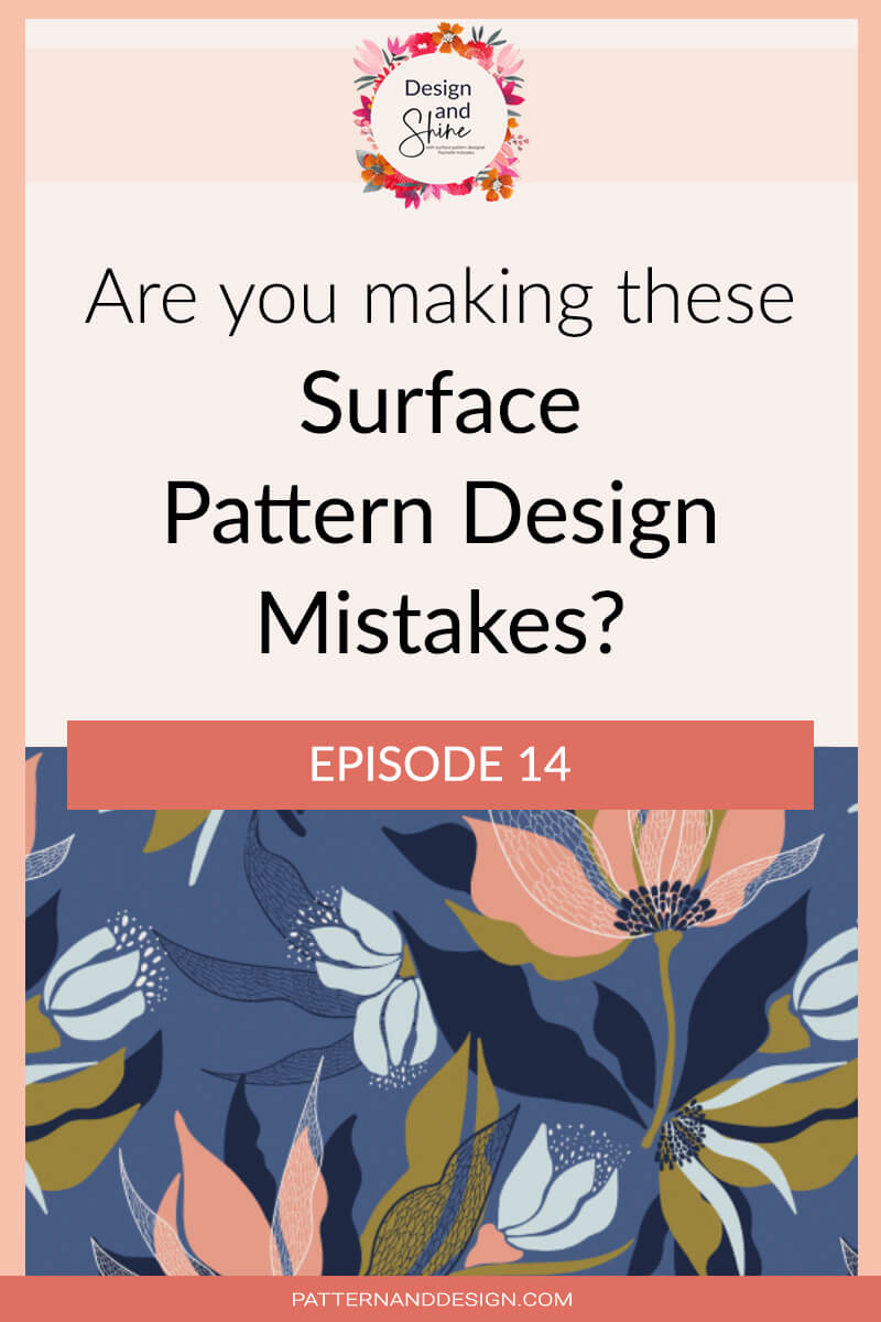
Are you making these pattern design mistakes?

We are going to talk about some of the most common pattern design mistakes that I see either when I’m working with my students or just in general online. These are things that you can think about or be working on next time when you’re creating your next pattern.
Tram tracking
The first thing I want to mention is something that is very common with people who are just starting out and that is tram tracking. Tram tracking is the unintentional spices that can occur within your pattern. And the reason this usually occurs is when the pattern has only been created to fit within the repeat square and the way the elements are going to repeat hasn’t been considered. This results in space around the edge of the square which becomes obvious when the design is repeated multiple times. It’s important when you’re creating a pattern repeat to ensure that it’s seamless so you can’t see where it starts and finishes.
Repeating the same elements too many times
The second thing that I often see is people repeating the same motif too many times within a design. I know that it’s a lot of work to create your motifs and sometimes people feel really reluctant to create a multitude of motifs and instead will reuse the same ones over and over again. I really recommend creating a good range of motifs so you have more to work with and you’re not limiting yourself with your end result.
repeating the same motif over and over again, within a design, just ends up making the design lack, interest, lack, depth. Although you can use the same motif in new and different and interesting ways within the design, just be really careful about overusing and reusing the same motif over and over again.
Consider the relationship between the motifs
The next mistake I commonly see is people not considering the placement of their motifs and therefore their pattern ends up not feeling balanced. It doesn’t feel cohesive in the way that all of the elements are working together. For example, if you haven’t thought about the balance of colour you may have a lot of one color in one area and not in others so when it’s repeated out multiple times, it just feels like your eye is drawn to this one spot throughout the design.
You want to think about the balance of colour and how you’re going to be placing that throughout the design, the balance of heaviness versus lightness, and just the way that you’re placing your elements within that square and making sure that they feel like they work together and they have a purpose for being in the space. Often, I feel like people are putting motifs in for the sake of it, but they’re not thinking purposely about the reason for putting them there, which brings me to my next mistake.
Too cluttered
The next mistake is putting in way too many motifs and feeling like all of the space has to be filled. Rather than really thinking intentionally and purposely about putting the motifs into the space and thinking about why they’re there, motifs are just added until the background space is filled.
Adding motifs for the sake of it, just to fill the space will just end up looking busy and it will look like a design that hasn’t been well thought out.
Background space
So that brings us to the last mistake I’m going to be talking about and that is not considering the background space. The foreground and the background space are equally as important as each other so you want to be considering that background space just as you’re considering the foreground space because the background space can be really powerful as also.
Make sure you listen to the podcast episode where we dive further into these mistakes
You can download my Pattern Design Secrets eBook here
Want to create another revenue stream by turning your art into surface pattern designs?
Get the free guide
Get my FREE Surface Pattern Design Starter Guide