learn about all things surface pattern design including the creative design process, being a successful creative entrepreneur & stepping into the mindset of a successful designer
welcome to the pattern design blog
blog
The
Categories
Popular
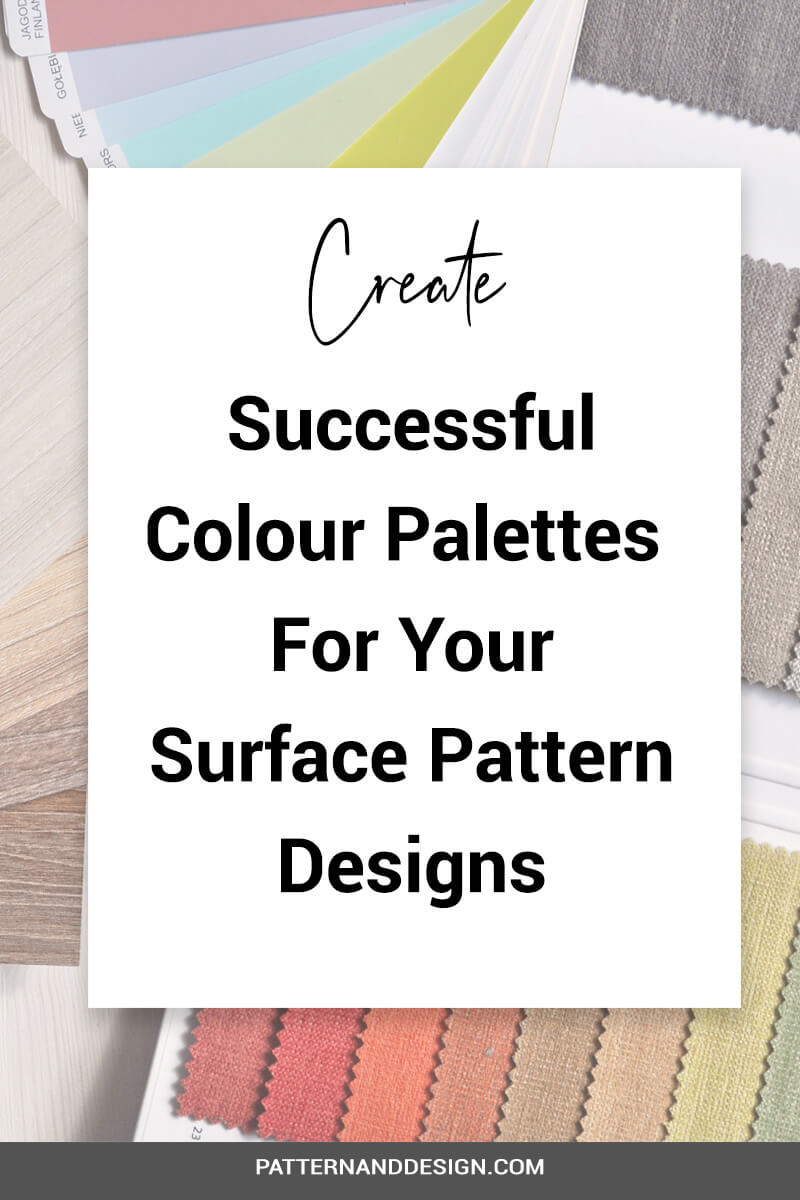
Create successful colour palettes for your pattern designs
One of the elements that you really need to think about and consider carefully when you’re creating your designs is colour. Having an understanding of colour theory is really important to know when you’re creating your pattern designs.
Why is colour important?
People will often be drawn to a design because of its use of colour. And I’m there have been plenty of times when you’ve gone into a shop and seen a beautiful dress and you just thought, oh, I wish it was in a different colour palette. When people see colour they have an emotional response to it and they immediately have a feeling of what they think about that design or product in terms of the colour. So working with colour and getting your colour usage right is really important to master when you’re creating your surface pattern designs because it really can make or break a design. And therefore it can be the difference between your design being sold or no.
So you really want to make sure that you do spend the time to really develop your skills in this area and it’s worth going back to the beginning and having a look and reminding yourself of some basic colour theory.
Understanding basic colour theory
That is understanding how colours work together and how you go about creating different colours and colour combinations e.g. how to get a tint, tone or shade, etc. By making sure you have a basic understanding of using colour, you’ll be able to move forward to create your own successful colour palettes intuitively.
Some people will naturally have a really good intuitive way of working with colour, a natural skill but for others, it will take time to develop and get right. But you do really want to take that time to get it right so you’re creating colour palettes that are successful.
Learn how to use basic colour theory and the colour wheel to create colour palettes here
Developing a colour palette
Before you start designing you should spend the time developing your theme and ideas and using the same research process you should also develop your colour palette for your collection. You want to research inspirational images that will inspire the colour palette that you will then use within your collections of designs. It’s important at this stage to spend the time making sure that you’ve created a really resolved colour palette. I would also recommend that if you are quite new to designing, then it’s probably better off not to create an extensive colour palette.
Often when I’ve worked with clients who are new to designing they often create colour palettes with an abundance of colours. Having too many colours in your palette will make it harder for your collection to remain cohesive unless you’re creating a large number of designs within that collection. Remember that colour is an important element that will help tie your collection together so you need to be able to use it consistently with your collections as it will be one of the main elements that tie your whole collection together.
How to ensure your colour palette is successful
To help create a successful colour palette, think about having a range of different tones so that you can have some light and shade, so you’d had some colors that are darker and some that are lighter. Think about having some colours that really are your main colours, your core colours or your neutral colours, and then some real pop colours that you’re only going to use as accents.
Think about the relationship between colours
When you’re creating your colour palette, it’s not only just selecting a beautiful group of colours, you also need to consider how these colours work together. For example, you might have a colour palette of 10 colours, but there might be certain colours within that palette that are only used as accent colours and if used as a background colour, just wouldn’t work or tie together with the range. There might be a couple of colours that just don’t work at all when they placed side by side so you may not be able to use those two colours next to each other.
So you want to think about not only about creating really good depth and range to the colour palette you create, but you also want to think about how each of the colours is going to relate to one another when you use them within your designs.
A really good way of testing how each of your colours within your palette works with each other is to create little groups with different combinations of the colours in your palette to see how they work when placed next to each other.
For more information on using colour within your design download your free colour cheat sheet here or find out about some free resources here
Want to create another revenue stream by turning your art into surface pattern designs?
Get the free guide
Get my FREE Surface Pattern Design Starter Guide


