learn about all things surface pattern design including the creative design process, being a successful creative entrepreneur & stepping into the mindset of a successful designer
welcome to the pattern design blog
blog
The
Categories
Popular
A Simple Guide To The Elements of Design
It’s good to go back to basics and understand the fundamentals behind what makes a successful design. When you’re new to designing, there is so much to consider that it can feel overwhelming. Sometimes you can tell that something isn’t working the way you’d like but you don’t know how to fix it.
When looking at the makeup of a design, you can break it down into 2 main categories. They are the elements and principles of design. By having an understanding of both of these you will be able to better create designs that work. Today we’re going to have a look at a simple guide to the elements of design.
A Simple Guide to The Elements of Design
So, what are the elements of design?
To put it simply the elements are the structure of the design. What the design is made up of.
The elements of design can be broken into the following categories:
- Line
- Direction
- Colour
- Shape
- Form
- Size
- Value/Tone
- Texture
Line
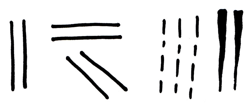
Line is the most basic of the all the elements. At its simplest form, it can be a mark between two points on a surface or it can create an edge where two ends meet e.g. outline of a shape.
Line is a very versatile element. It can be used to describe to create outlines, shapes, and direction.
There many different ways line can be used including:
- Changing its direction e.g. horizontal, vertical or diagonal etc.
- Changing its width e.g. thick, thin or tapered etc.
- Changing its length e.g. long, short or dashed etc.
Direction
The direction is the course along which the line moves.
Different ways direction can be used include:
- Horizontal
- Vertical
- Diagonal
- Curved
- Zigzag
Colour

Primary Colours

Secondary Colours
Colour or hue sets the mood of a design.
Colours can be broken up into Primary, Secondary and Tertiary colours.
Primary colours are red, blue and yellow
Secondary colours are orange, green and purple. They are made by mixing combinations of two primary colours together.
Tertiary colours are those colours that sit between the secondary and primary colours
Earth colours are made by mixing two secondary colours together and result in earthy colour ranges.
You can download the link below to get my colour cheat sheet which will give you definitions for basic colour theory.
Colours can also be also grouped together into colour schemes.
To find out more about colour schemes, check out my blog post here.
Shape
Geometric Shapes
Organic Shapes
A self-contained area defined by where two lines meet.
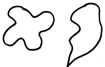
Shapes can be geometric or organic in form.
Geometric shapes are uniform and regular and include triangles, squares, and rectangles.
Organic shapes are free-flowing and unpredictable often seen in nature such as a leaf.
Form
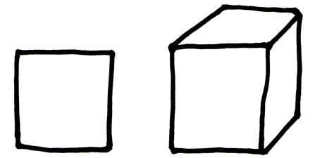
Form refers to the mass of an object and usually describes an object that is 3-dimensional e.g. a square is a shape while a cube is a form.
Size
Size refers to the relationship between one object to another.
Value/Tone

Tints

Shades

Tone
Value refers to the lightness or darkness of a colour.
By adding white to a colour we get a tint and by adding black to a colour we get a tone.
The tone of a colour can be broken into high (light tones), mid (intermediate tones) and low (dark tones).
Don’t forget you find out more about colour definitions from my colour cheat sheet.
Texture
Texture is the surface quality of an object e.g. rough, smooth, bumpy etc.
It can be real or implied. Real texture is a surface that when touched has a textural quality to it e.g. a smooth surface or a rough surface. Implied texture is a surface that looks like it’s textured but is not e.g. wallpaper made to look like concrete.
Now you know the elements of design. Try considering them next time you’re designing.
Want to create another revenue stream by turning your art into surface pattern designs?
Get the free guide
Get my FREE Surface Pattern Design Starter Guide


