learn about all things surface pattern design including the creative design process, being a successful creative entrepreneur & stepping into the mindset of a successful designer
welcome to the pattern design blog
blog
The
Categories
Popular
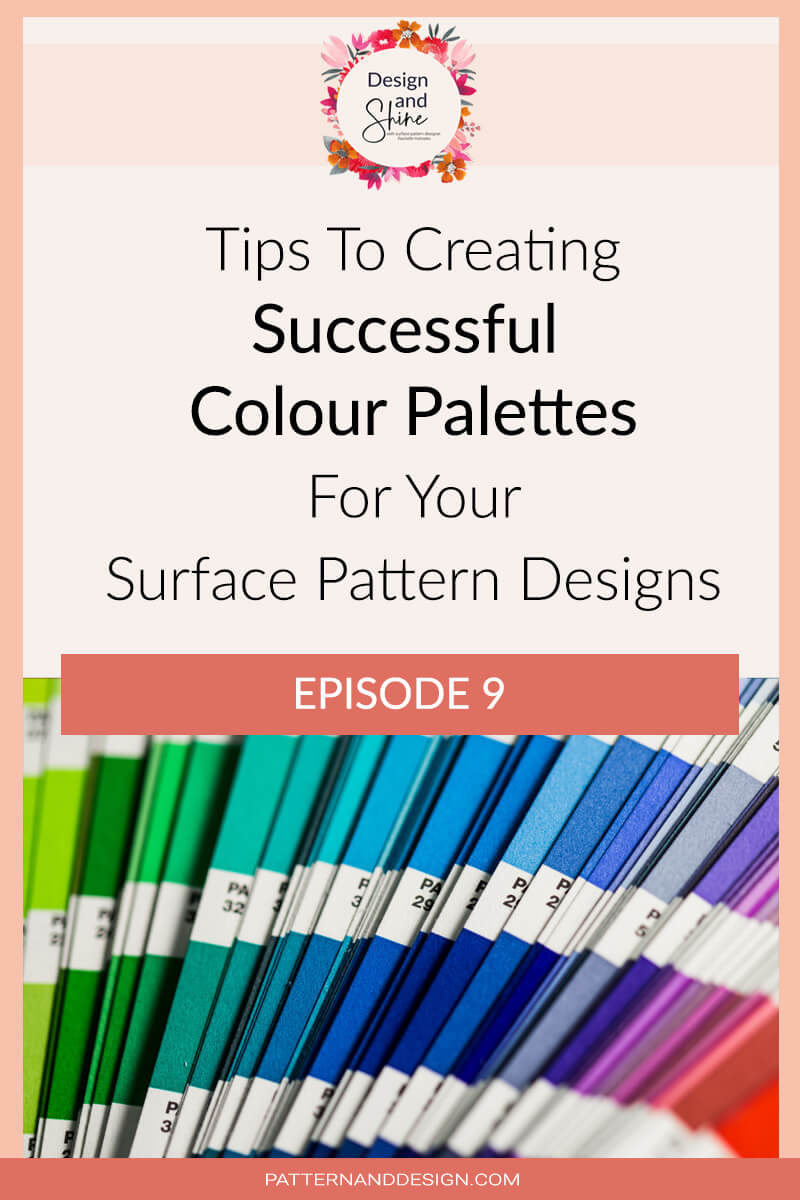
Tips for creating successful colour palettes
Colour is such an important element within a design and can often be the reason a design is successful or not. It can really make or break a design and it can be the reason someone purchases your design or not so you want to really carefully consider the colors that you’re using within your designs.
People are often drawn to a design because of its use of colour so it’s important as a surface pattern designer that you develop your colour skills. Some people will naturally be just really great at using color and they’ll have a natural flair for it but if you are someone who struggles with using color, then you really want to make the time to spend developing these skills. If you’re not feeling confident with using colour then a great place to look is at color theory.
Colour palette
A color palette is a group of colours that you have selected to work together, and you’re going to use those colors within your design. So I wanted to talk about some of the things that you need to think about so you’re ensuring that you are creating really successful colour palettes.
When I’m giving feedback to my students in my Pattern to Product Mentoring program one of the most common pieces of feedback I give them when they show me their colour palettes is that they lack depth.
The simplest way to do these is by thinking about having some lighter colors, some mid-tones and some dark tones. Now, when I talk about lighter and darker tones, I’m talking about the tonal difference. If you choose colors that have all got the same tonal value, what ends up happening is your design can end up feeling like it’s very flat and they can lack depth. Using colours with different tonal values will allow you to really achieve a great sense of depth to your designs.
Listen to the podcast where I share more tips for creating successful colour palettes.
You can download my Pattern Design Secrets eBook here
Want to create another revenue stream by turning your art into surface pattern designs?
Get the free guide
Get my FREE Surface Pattern Design Starter Guide


